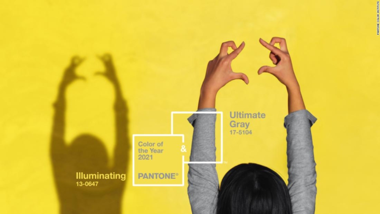
As 2020 nears its tumultuous end, the Pantone Color Institute has taken up its annual task of forecasting the color that will best reflect the year ahead.
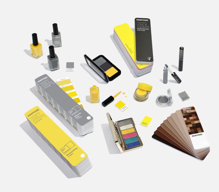
And, in a decision befitting a complex time, the color authority -- which standardizes swatches for the design industry -- has revealed not one, but two hues for its Color of the Year: the neutral Ultimate Gray and vibrant yellow Illuminating.
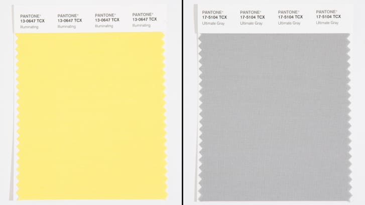
"It's a combination that speaks to the resilience, the optimism and hope and positivity that we need, as we reset, renew, reimagine and reinvent," said Laurie Pressman, vice president of the Pantone Color Institute, in a video call along with executive director, Leatrice Eiseman.
It's the first time an achromatic shade (gray) has been selected, and the second time two colors have been chosen.
In 2016, the pale pink and blue hues, Rose Quartz and Serenity broke the norm when they were presented as a gradient.

Though Pantone selecting two colors might be seen as hedging its bets -- a gray or yellow, depending on how 2021 unfolds -- Pressman and Eiseman want people to consider the colors' impact as a unified pair, hinting at the importance of solidarity in the coming year.
"Two extremely independent colors highlight how different elements come together to express this message of strength and hopefulness," said Pressman.
Therapeutic implications
Pantone's Color of the Year reflects color trends in fashion, beauty, design and home decor, and since the beginning, the initiative has also served as a mood ring of sorts, selecting the hues capturing the spirit of the time.
In years with undercurrents of uncertainty -- such as 2020's global pandemic -- that has often meant choosing colors that are meant to soothe, calm or uplift.
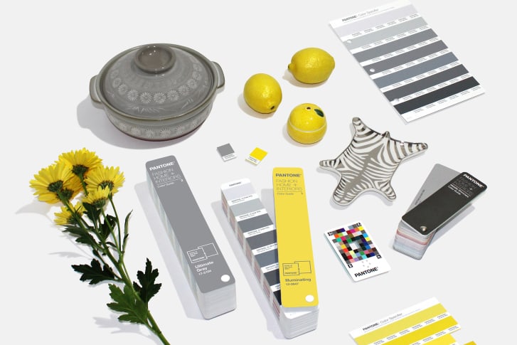
Serene blue shades have made several appearances over the past two decades, but the only other time an optimistic yellow hue has been selected was during another widespread economic crisis.
For 2009, Pantone chose the lively Mimosa, projecting a sense of hope as the Great Recession of 2008 rocked North and South America and Europe.
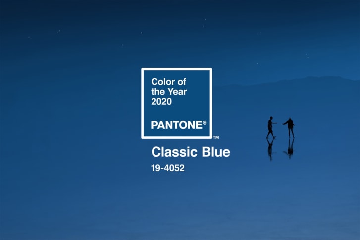
Last year's choice, Classic Blue, offered a sense of reassurance as the world moved into a new decade, as well as a balm to feelings of instability and unrest. It was selected just before COVID-19 became an international crisis.
"In retrospect, now we look back at it and think, 'Well, that was a fortuitous choice for the year," said Eiseman.
It was a decision that echoed the company's first Color of the Year: 2000's Cerulean, chosen ahead of the new millennium when fears over the Y2K computer bug dominated the news."It was an interesting dichotomy of feeling," said Eiseman.
"It was the fear of what might happen. So (it was chosen) to help alleviate that fear. But the blue sky denotes that there's a future out there ... there's something to look forward to. So it was a very thoughtful choice from the beginning."
Past colors have sometimes been a bit more blatant in their correlation to current events. Take 2019's energetic Living Coral, for instance, which highlighted the beauty of the ocean's microorganisms, but also warned of its disappearance, as warming oceans due to climate change have bleached coral populations.
In late 2016, following the U.S. presidential election, Pantone selected Greenery for the following year, alluding to political turmoil and calling the colour a hue for restoration and renewal.
"Our goal is to engage people in a conversation around color," said Pressman. "It has to be organic. It has to be truthful to what's taking place."
Though Pantone is known for its color forecasting and trend reports, Pressman said the Color of the Year is not driven by data.
"What are we looking for? What do we need? And what are the psychological characteristics of that color that can give us what we're looking for?" Pressman posed.
The decision is informed not only by the state of the world, but also what's happening in the fashion and art spheres. But this year, she said, "you can't get away from the overwhelming influence of the pandemic."
Psychological associations
According to Pantone's press statement, Illuminating is associated with optimism and vivacity, while Ultimate Gray encourages "feelings of composure, steadiness and resilience."
In her own research into color associations, Eiseman has found that yellow is often associated with "cheer" and "happiness," due to its correlation with the sun.
A small peer-reviewed study from 2019, led by Swiss psychologist Domicele Jonauskaite, came to a similar conclusion. The study used music and images to induce particular moods in its 125 subjects, then asked them to choose colors to match their moods.
Participants most often associated the color yellow with joy.
In 2020, Jonauskaite and her team conducted a larger international study online of color-emotion pairings to see if differences in nationality or language influenced associations. Out of nearly 4,600 participants across 30 nations, most chose yellow for joy.
Pantone's selection for Ultimate Gray, however, is a bit more complicated. Though it was selected for its qualities of fortitude and reliability -- it's the color of stone, and a classic neutral in a wardrobe -- according to Jonauskaite's research, gray is linked with negative moods like sadness, fear and disappointment.
In a year marked by mass illness and economic anxiety, such a selection isn't off base. But Pressman thinks gray can be a bit more versatile and open to interpretation. She and Eiseman point out it's a mid-gray, not a "heavy" shade.
However people interpret Pantone's choices this year, Pressman and Eiseman emphasize the strength of bringing two disparate colors together.
"What we were trying to demonstrate was how you have different elements that come together, and it's that coming together that expresses the strength and the hopefulness," said Eiseman.
"I think (one) thing that's become abundantly clear during this time...across the world is this deeper understanding of how much we need each other," said Pressman.
"How our connections to other people, our relationships with other people, give us that emotional support."
Latest Stories
-
Expansion Drive: Takoradi Technical University increases faculties
3 hours -
SHS heads demand payment of outstanding funds before reopening of schools
4 hours -
We thank God for the 2024 general elections – Akufo-Addo
4 hours -
Coconut Grove Beach Resort marks 30 years of excellence with memorable 9 lessons & carols service
4 hours -
WAFU B U-17 Girls’ Cup: Black Maidens beat Nigeria on penalties to win inaugral tournament
5 hours -
Real Madrid beat Sevilla to keep pressure on leaders Atletico
6 hours -
Liverpool put six past Spurs to go four points clear
6 hours -
Manchester United lose 3-0 at home to Bournemouth yet again
6 hours -
CHAN 2024Q: ‘It’s still an open game’ – Didi on Ghana’s draw with Nigeria
6 hours -
CHAN 2024Q: Ghana’s Black Galaxies held by Nigeria in first-leg tie
7 hours -
Dr Nduom hopeful defunct GN bank will be restored under Mahama administration
8 hours -
Bridget Bonnie celebrates NDC Victory, champions hope for women and youth
8 hours -
Shamima Muslim urges youth to lead Ghana’s renewal at 18Plus4NDC anniversary
9 hours -
Akufo-Addo condemns post-election violence, blames NDC
9 hours -
DAMC, Free Food Company, to distribute 10,000 packs of food to street kids
10 hours

